Wisconsin State Flag
The following article is written by Carrie L. Estrella for the Rahr-West Art Forward series.
Have you ever thought about what makes a good flag?
Vexillology is the study of the history, symbolism, and usage of flags. According to the Encyclopedia Britannica, a flag is simply “a piece of cloth, bunting, or similar material displaying the insignia of a sovereign state, a community, an organization, an armed force, an office, or an individual.” It continues that “flags originally were used mainly in warfare, and to some extent they have remained insignia of leadership, serving for the identification of friend or foe and as rallying points. They are now also extensively employed for signaling, for decoration, and for display.” In many ways, a state flag is an artistic representation of who we were, or are, as residents of that state.
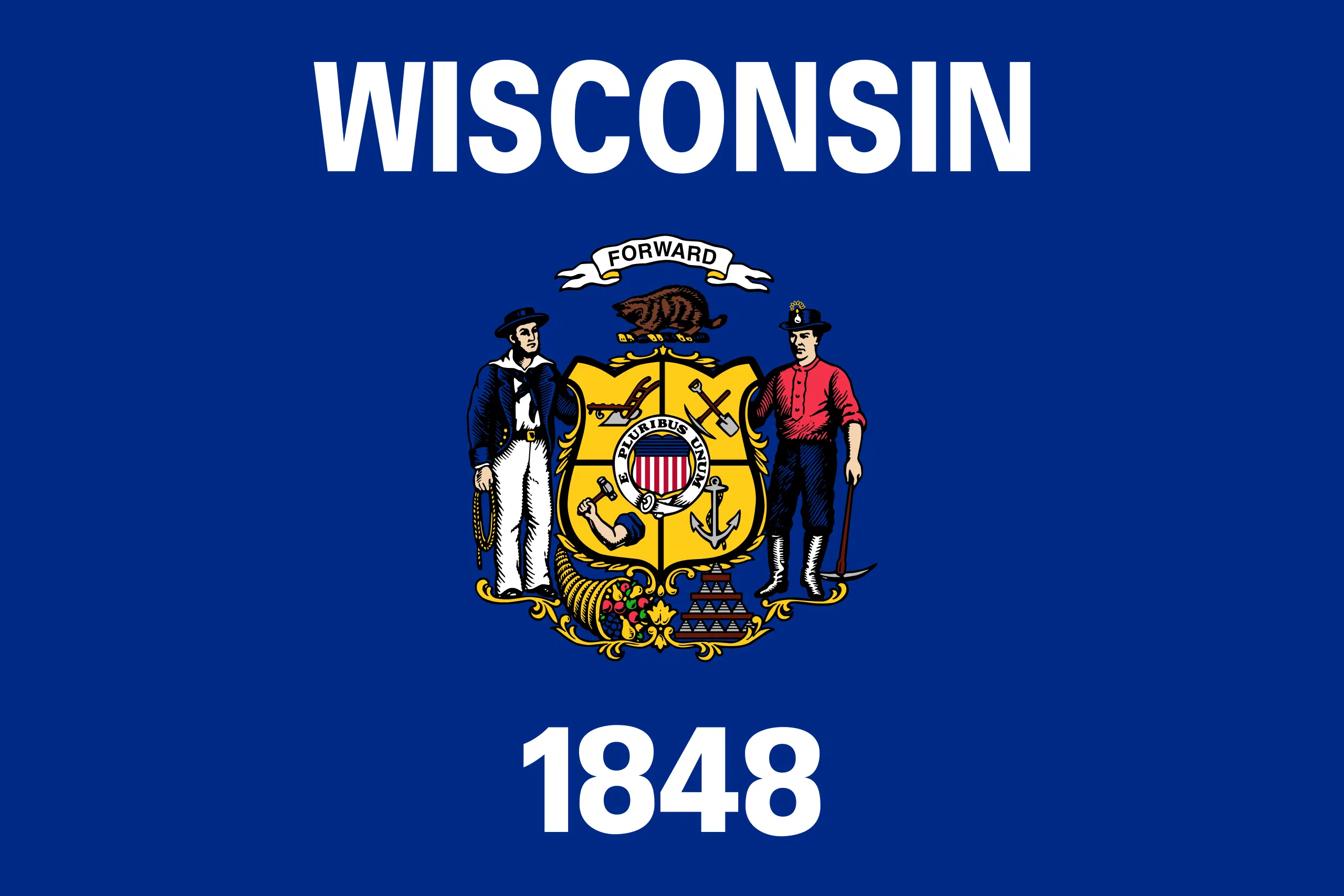
Surprisingly, Wisconsin didn’t even have a flag for its first 15 years of statehood. Our flag was originally designed in 1863 for the Civil War when regiments from Wisconsin requested one for battlefield use and it wasn’t until 1913 that the design for the state flag was actually documented in the state statutes, specifying a certain dark blue for the background with the Wisconsin coat of arms centered. In 1979, adjustments were made to the design so it would appear more distinctive and recognizable from other state flags by adding the word “Wisconsin” and the statehood date of “1848” in white letters and numbers, centered above and below the coat of arms. Indeed, since May 1, 1981 all Wisconsin state flags have been manufactured to these specifications, thus we are currently using the third version.
A 2001 survey of flag design published by the National American Vexillological Association ranked the Wisconsin flag as one of the 10 worst flag designs in the U.S. and Canada. In a 2016 article in Madison’s weekly newspaper, Isthmus, vexillologist Edward B. Kaye points to the too-small coat of arms and details that cannot be seen from afar. In other words, the Wisconsin flag is just too busy. “Coats of arms are meant to be viewed close up and simply don’t belong on flags,” Kaye says. “It’s just crummy design.” In the same article, when asked about the redesign of the 1970’s, Kaye replied that it only made things worse. “What would you think of France’s flag if it said ‘France’ on it?” Kaye says. “Flags are graphic symbols. Adding words defeats the whole purpose of a flag.”

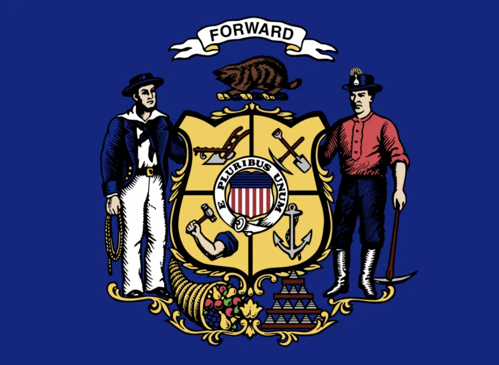
In case you haven’t had the opportunity to view the Wisconsin state flag up close recently, here’s a reminder of everything you can “see” in our coat of arms:
- At the very top: the state’s motto: “Forward.”
- Beneath the motto and above the shield is a badger
- Along the left-hand side of the shield stands a sailor
- Along the right-hand side of the shield stands a miner
- Below the shield, adjacent to the sailor, is a cornucopia
- Below the shield, next to the miner, is a pyramid stack of 13 lead blocks (ingots)
- The shield, which is at the center of the coat of arms is actually officially referred to as the Golden Seal Of Trades. It is split into 4 quadrants representing the primary trades of the state: anchor, arm & hammer, pick & shovel, and plow. In the middle of the shield is a smaller red, white and blue coat of arms encased within a white border that has the national motto: “E pluribus unum” written on it to show our tie to the United States.
Redesigning our state flag isn’t entirely out of the question. Last year Mississippi chose a redesign with a magnolia flower to remove the image of the Confederate States Battle Flag and Utah recently established a task force to look at making their flag more recognizable amongst a sea of blue backgrounds with a coat of arms at the center (just like Wisconsin.)
Over 90 years ago the state of Alaska undertook the design of its own flag – but instead of assigning the task to bureaucrats, the project was opened to residents, finally settling on a design by a thirteen-year-old orphan, Benny Benson, in response to a contest sponsored by the Alaska Department of the American Legion in 1927.
Perhaps it is time we consider a redesign that would help the Wisconsin flag stand out from the rest – simplifying the design and choosing a new color scheme to help differentiate us, thus making our flag more recognizable from a distance. It would certainly make for an engaging exercise in art.
Until then, let’s celebrate our current state flag’s birthday by remembering the five-member joint select committee tasked with reporting out on “a description for a proper state flag” back in 1863. No matter how hard I searched, I was unable to find these committee members identified by name – but one thing is for sure – their hard work has lived on for over 150 years, highlighting the bounty of our state and paying tribute to our diverse history!


