The following article was submitted by Emily Ellerman, a Marketing Technician with the Manitowoc Public Library, and Tim Gadzinski, MPL’s Marketing Associate.
It’s happened to all of us on a personal level. You make a purchase. Maybe it’s an outfit for a special occasion. Or perhaps a quirky tchotchke to commemorate a special getaway. At first, these things are fantastic! They say everything about you that needs to be said. They’re meaningful and expressive and help to pull your identity into focus. At least for a little while. However, over time that immediacy begins to fade. The outfit gets a bit worn and the colors fade. And that souvenir? At best it seems kind of silly. In fact, after enough calendar pages have blown away, you can’t even truly remember why you made these purchases in the first place—there’s barely any connection to you at all anymore.
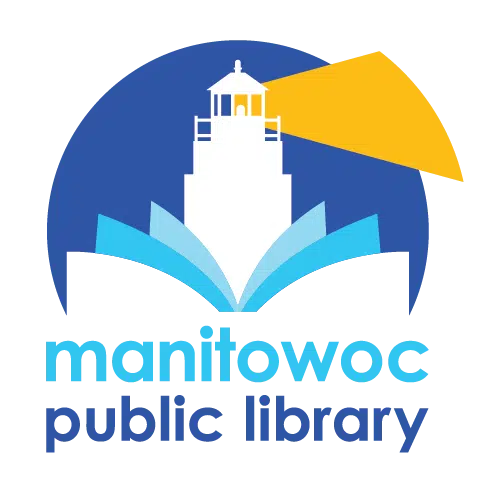
The same sort of thing can happen on a professional, institutional level, too. And Manitowoc Public Library can point to an excellent and very specific example. In the recent past, it became very clear to us that our logo and our website weren’t nearly as representative or functional—respectively—as we needed them to be. So, we decided to do something about it! It’s with more than a little pardonable pride that we can now officially present you with MPL’s new logo and new—and definitely improved—website!

Emily Brandt
Not like this was something that happened overnight. Truth be told, work on these recreated components began in Fall 2020—nearly two-and-a-half years ago. We had just completed our new Marketing Plan and Strategic Guide for the Library. The plan reconfigured how best to get our message to the community, not just about all the amazing things happening at MPL, but to more accurately convey what we stood for, as well. Which in and of itself was directly linked to the “2019-2023 Strategic Plan” for Library Development. So, you can see this wasn’t a snap decision. Nor was it a task that we took lightly. Because if we were going to make a shift like the one we were planning, it was crucially important to do it right.
It’s always been an important aspect of our mission at MPL to actively evolve alongside our community—and if possible, anticipate their needs. Our old logo and website had long since outlived their usefulness in expressing what we were all about.
Our previous logo, for example, utilized a font that hardly anyone can tolerate anymore—the dreaded Papyrus. The sole visual element in that logo was an architectural feature—a line-drawing of the turret on the northwest corner of the Library. While this may say something about the literal building, it doesn’t express anything about who we are and what we do. MPL is about a lot more than a turret and we definitely needed a better visual representation to quickly convey that message.
And the old website? Well, it was just that—old. It wasn’t easy to navigate, it lacked visual pop, the calendar was clunky (and about to be phased out by the firm that hosted it) and, in general, made it somewhat difficult for our patrons to rapidly find what they were looking for. Don’t get us wrong—an array of people over the years had attempted to adjust it to make it better. But, it had gotten to the point where you could blatantly recognize that there had been too many cooks in the kitchen. It had become a mish-mosh of nonesuch that lacked functionality. It was time for a change.
There’s no way to fully express all the work that went into the process of creating our phenomenal new logo—conveying local heritage and a rock-solid foundation while indicating that MPL is a beacon for our community—and the new website—with an array of fantastic new features (such as the incredible events calendar or its overall user-friendly, intuitive, and accessibility-focused interface—in the space of a single article.
An absolutely “Readers Digest” version of this journey would be that after all the research and homework was done, and all the dust had settled, we were incredibly fortunate to have found Library Market—a website and graphic design firm that works exclusively with libraries. Not only do they only work with libraries, many of the people at Library Market had previously been employed by libraries. Without their guidance and expertise, we wouldn’t have arrived at such a spectacular destination. And we’d be absolutely remiss if we didn’t mention that the team assembled to take on this at-times daunting task was First-Rate. Dedicated, devoted, creative, flexible, and tireless only begins to sum them up.

Tim Gadzinski
One look at the logo will convince you that we definitely made a great decision with our revamped visual branding presence. In fact, according to our research, an institution has less than a single second to make a positive, memorable impression on a viewer. Thanks to Library Market’s amazing staff, we know we succeeded.
The website will take a bit longer than that to explore, but it’s definitely time well spent. Head to www.manitowoclibrary.org (same URL, utterly different destination). Have fun! Click around to your hearts’ delight! Check out the new events calendar. Take a gander at our Premium Online Resources page for the amazing offerings available from MPL when you’re not at MPL. Check out the Staff Picks—for Kids, Teens, and Adults—for recommendations on great reads. Or see what we have in Special Collections! We guarantee that there are materials available that you never even knew we had!
These examples just scratch the surface of what’s available on the new MPL website. Obviously, we’re rather excited about and exceptionally pleased with the results that Library Market delivered. We’ve said it before and we’ll say it again—Manitowoc Library is about so much more than books! Now, why not find out for yourself? Head to www.manitowoclibrary.org and start your journey of discovery!


